Difference between revisions of "Talk:ProgClub logo"
From ProgClub
(Created page with "Actually, there are two pics of a club there - one full-size and one close-up of the tip. Thus, at first glance, it looks more like a morningstar than a club. ...figured you mi...") |
|||
| Line 6: | Line 6: | ||
(congrats on the awesome mediawiki theme by the way!) | (congrats on the awesome mediawiki theme by the way!) | ||
| + | |||
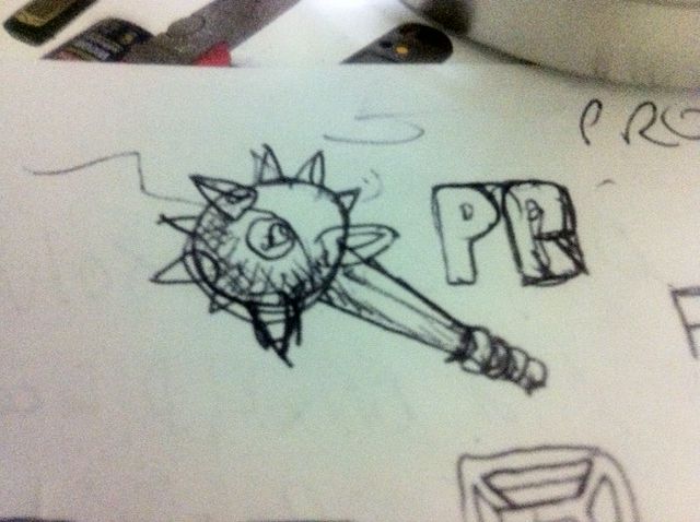
| + | The current logo is just a stand-in while ProgClub's graphic artist comes up with the real logo. The real logo is a single image of a club. Below is the first sketch. | ||
| + | |||
| + | [[User:John|John]] 16:34, 5 August 2011 (UTC) | ||
| + | |||
| + | [[File:Logo sketch.jpg]] | ||
Revision as of 02:34, 6 August 2011
Actually, there are two pics of a club there - one full-size and one close-up of the tip.
Thus, at first glance, it looks more like a morningstar than a club.
...figured you might wanna know... :-)
(congrats on the awesome mediawiki theme by the way!)
The current logo is just a stand-in while ProgClub's graphic artist comes up with the real logo. The real logo is a single image of a club. Below is the first sketch.
John 16:34, 5 August 2011 (UTC)
