Talk:ProgClub logo
From ProgClub
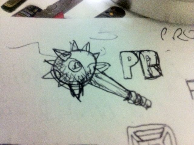
Actually, there are two pics of a club there - one full-size and one close-up of the tip.
Thus, at first glance, it looks more like a morningstar than a club.
...figured you might wanna know... :-)
(congrats on the awesome mediawiki theme by the way!)
The current logo is just a stand-in while ProgClub's graphic artist comes up with the real logo. The real logo is a single image of a club. Below is the first sketch.
John 16:34, 5 August 2011 (UTC)
